
Archive
• June 2005• July 2005
• August 2005
• September 2005
• October 2005
• November 2005
• December 2005
• January 2006
• February 2006
• March 2006
• April 2006
• May 2006
• June 2006
• July 2006
• August 2006
• September 2006
• October 2006
• November 2006
• December 2006
• January 2007
• February 2007
• March 2007
• April 2007
• May 2007
• June 2007
• July 2007
• August 2007
• September 2007
• October 2007
• November 2007
• December 2007
• January 2008
Sunday, July 01, 2007
 A comment by Gil over at the Capcom Digital site:
 The person doing the new sprites is a tracer and nothing more. The following statement...
"he looked like a giant troll. That’s why the head was moved up and made a little smaller."
...is certainly misleading. It suggests the head was redrawn from scratch.
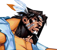
In fact the head was probably altered because it seems it was more convenient for the guy who's doing those terrible new sprites to TRACE the portrait of T-Hawk from an artwork for Street Fighter 2 - Turbo Revival (GBA). [picture]
 The artwork was drawn by Capcom's Edayan. Why not mention this? If all you do is what seems to be TRACING Edayan's art why not hire HIM to do the job?
If the persons involved with this project are as big Street Fighter fans as they pretend to be they should at least give credit to the original Capcom artists when they trace their stuff. The whole matter is very disrespectful towards the original creators of the Street Fighter series.
If you guys TRACE over existing artworks at least mention which ones you are tracing and give them credit in your blog updates.
I'm still looking forward to this project but hope you will change the artist who is in charge of the sprites. [NeoGAF, Pixelation discussion]
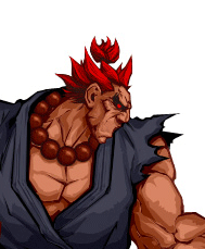

Here's an unfinished proof of concept by Helm, and some words from the artist himself:

"Hello, I am Helm. Since this is a public project on the internet, I assume that criticism, no matter how harsh it might appear, is welcome. Here are some thoughts:
First of all my art is not finished (no, not even the parts that look finished. It would take more smoothing, more range and some overpainting to call it done) so I'm a bit ashamed anyone would link to it. I had to stop working on it for a period of time and when I returned to it my incandescent zest to go through with this had all but evaporated. I did some minor touchups and thought 'why am I still doing this? This is a stupid way to do game art. Should I spend another hour proving a fanboy point?' and posted what I had and hoped that would be the end of it. I don't think my take is particularily breath-taking, but I do think it's more pleasing than that's going on.
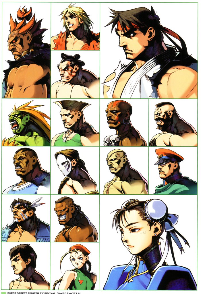
Some people will say 'HE CHANGED THE STYLE!' when they see this. I'd like those people to go back to the SFII art and notice something: It doesn't look like anime. It's intentionally more westernized by the capcom art direction. The portraits aren't all angular-jaws-dark-eye-shadows-huge-hips like the newer SF stuff so I say my attempt is more in keeping with the vanilla SFII art than the Udon art.
There's many problems with how Udon is doing this. The biggest and most glaring problem is that whoever is in charge does not have the anatomical knowledge of the capcom staff that made SFII. And SFII isn't exactly the wonder of anatomy (nor is my attempt). The second problem is that they're mixing styles. They take a t-hawk head from an illustration, put it on a turbo sprite... it doesn't work like this. If you're getting paid to do a remake of a very well-loved game, you might want to invest some thought in coherent aesthetics and art direction. Finally the people working on this are pillow-shading. Sprites are sprites, when you're doing illustration work (this isn't animation work as it should be, really) then you shouldn't just go with a silly 'darker around the edges, lighter towards the middle' mindset. It comes down to this: when you REMAKE something, you make sure to hire people who can do it BETTER than the original crew.
All this screams for me, at tiny budget. How many people are doing the art here? I estimate that I could do about 3 frames in a workday if I were under contract to work on this, given I'd have some time to get my methodology streamlined. SFII has how many frames of animation? 1200? How fast does the team have to work to get through those? What are they expecting? Seems like a bad plan. I expect this to get cancelled soon.
If I can put a single comment on the actual remaster idea it'd be: it'll look awful, even with the greatest HD art in the world, without more inbetween frames. Bigger resolution = bigger spatial gaps between frames. It'll look like a Monty Python animation."
Recent Comments
Recommendations
Previous Posts
• Akuchizoku Progress Update• Hurrican Review
• Flash Feature in Edge
• Three Hundred Update
• Previous Entries
• Previous Entries
• Bite the Bullet
• Odyssen Preview
• News
• News
2007 © Independent Gaming.
Was a stupid idea in the first place.
The fact that they're just replacing the sprites to new drawings worries me.
They should be hiring animators because each individual drawings may look pretty but it could look wonky in full motion.
Nice info.. Thanks!
Maybe just me though, but the real question is: would these mistakes have ever been noticed if the project wasn't as open as it is? :(
People don't get it that this is still SF2, just prettier. Where's the problem with this?
Some fans are serious nitpickers.
It's a joke...
Don't want to flame or something but is this something you experienced or do you just take repeat what others stated. Imho if the sprite is highres but the animation is simple it will simply look static, having a very flash game like look. Whether this looks good or not is completely subjective. I admit the wrong color palletes or strange looking anatomy are kinda fishy but this is nothing that can't be fixed so this whole affair sounds very much like nitpicking by the wannabe hardcore to me...
@leo
Because that's not the aim of this low budget project. My guess is that IF this project turns out successful Capcom will start thinking about a new 2D SF...
If it sounds like I'm repeating what someone else I said, I'm afraid I'm just in agreement with other people. I could easily say that you're just repeating what many other people have stated as well.
I agree that opinions are generally subjective, but on a technical level, the quality here is seriously lacking.
Guilty Gear's animations while nowhere near SFIII smoothness are for the most part fine too, if a tad choppy in places.
all wrestlers should be drawn like that as well. you should see zangief's proof of concept. ;)
- tim
Yes, I've played Guilty Gear X (mainly X2 Reloaded) and SF3-3rdStr quite a bit. You're absolutely right that this titles have superb animation but the problem here is that SF2-HD Remix is a low budget experiment by Capcom while the 2 games mentioned at the beginning are expensive full price titles made first and foremost for the arcades. Apples and Oranges I'm afraid. I agree though that a new 2D SF with high quality animation would be the better news. I consider this HD remake a test run. Btw, many people absolutely loved the flash-like appearance of Odin Sphere because it looked like the pages of an illustrated book came to life.
It'd be easier for me to be okay with the fact that they aren't changing the code (thus leaving the animation poor) if the quality on such a low amount of frames was better overall. UDON are supposed to be 'professionals' and yet, their work is just really poor here.
In fact, what confuses me the most is how drastically different the art style for these sprites is when you compare it to the UDON SF comics. I haven't seen any glaring problems in those that these sprites display. Sure, the anatomy is exaggerated, but it doesn't necessarily look all that wrong in the comics. The muscles on these sprites in particular are really wonky.
The original game runs in 4:3, but at 384x224 resolution -- meaning it uses non-square pixels. This is why your Sagat looks short and fat.
He also doesn't look like Sagat -- you've gone way overboard on the westernized style.
http://stifu.free.fr/momoko/534826665_69544f00c2_o.PNG
http://www.neoempire.com/forum/index.php?showtopic=1890&st=75
@shaheen
Oh, ok. I guess I did misunderstand your post about GGX2.
I myself thought the animation was quite nice there, certainly not as good as SF3 or Garou, but still.
I can imagine that the problem for UDON here is that they have to stay extremely close to the original sprites - pretty heavy artistic limitations for comic book creators. I like Helm's version of Sagat but I also think that UDON is trying to pull off a completely different style here.
So well, I really like the idea of an HD remake and hope the harsh criticism helps UDON to come up with a better product.
THERE IS NOTHING TO PROVE HERE!
the sprites are made by capcom and the heads of the street fighters
are also made by capcom!
now the heads of the charaters are drawn from scratch!
they are just based on the heads of the icons!
they are not edited or somethin.
whoever started this topic must'n have been an artist!
i'm an artist and i can see it learly that those heads are not traced!